
Horlicks
PACKAGING DESIGN
With over 70 years of consumer trust and popularity, Horlicks is an iconic Health Food Drink (HFD) in India with more than half of the market share in the category.
Previously, Horlicks had been following a divergent strategy across product variants with respect to packaging structure and graphics. The challenge was to develop a masterbrand strategy and create a compelling visual architecture that could facilitate their new width across all their existing products while providing a framework for future products.
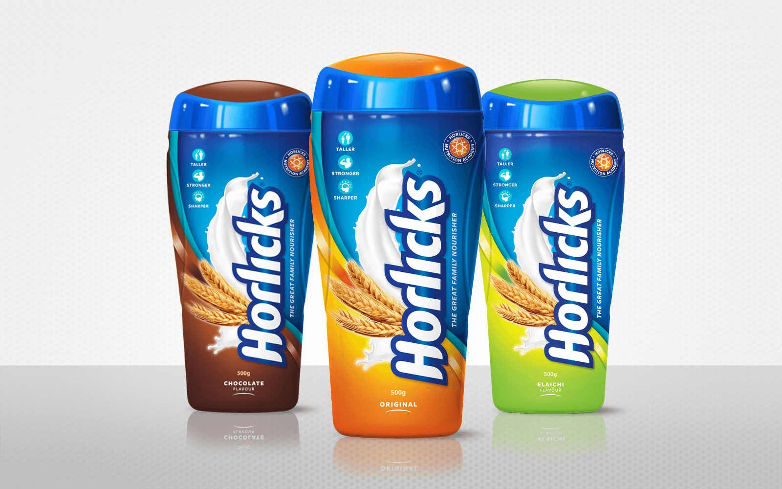

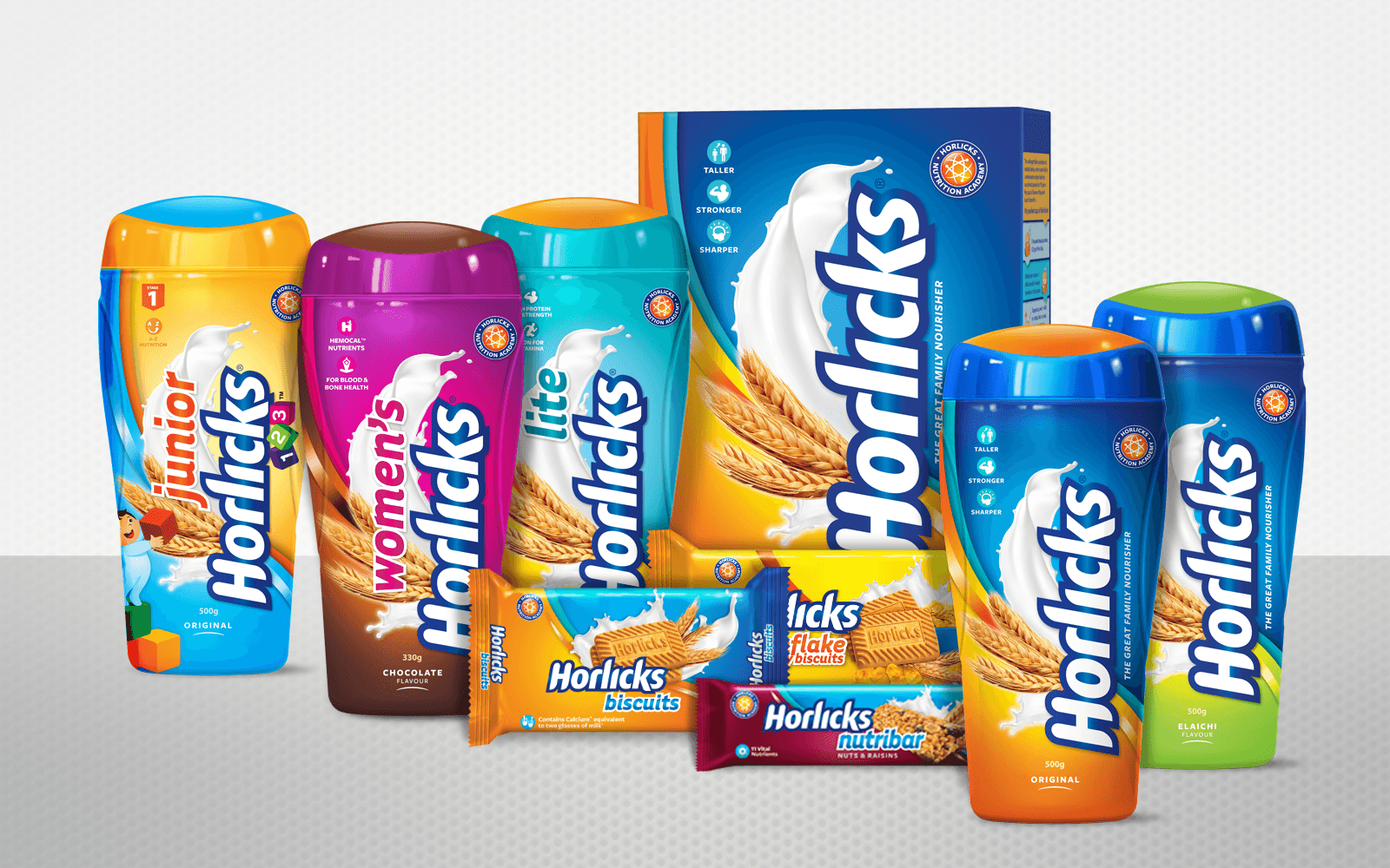
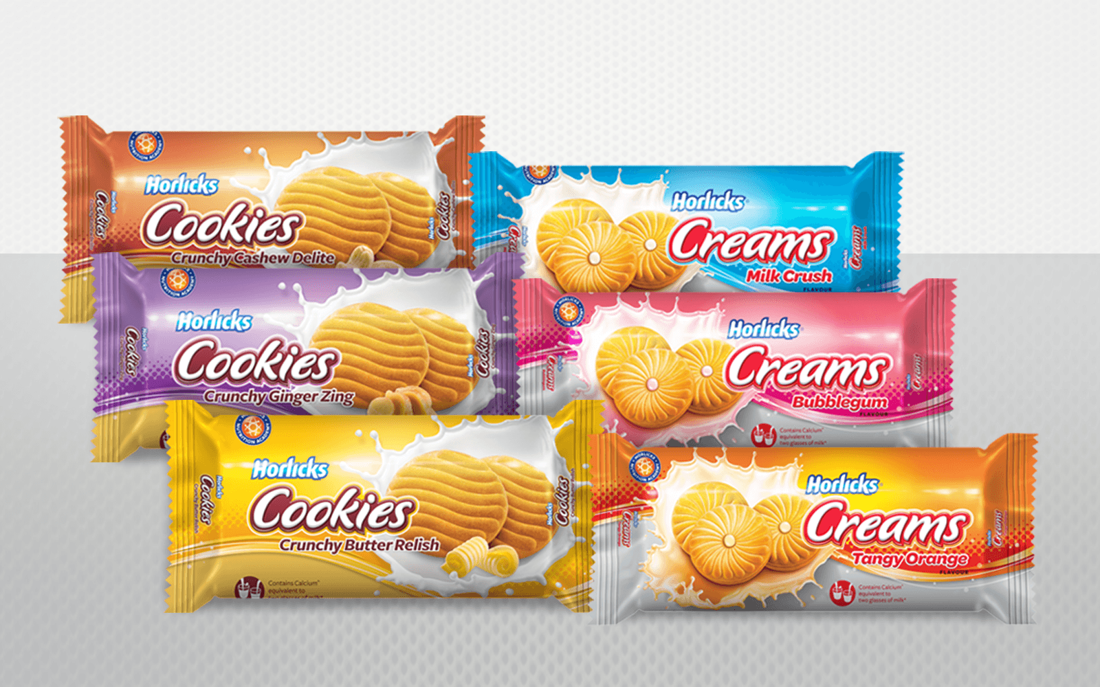
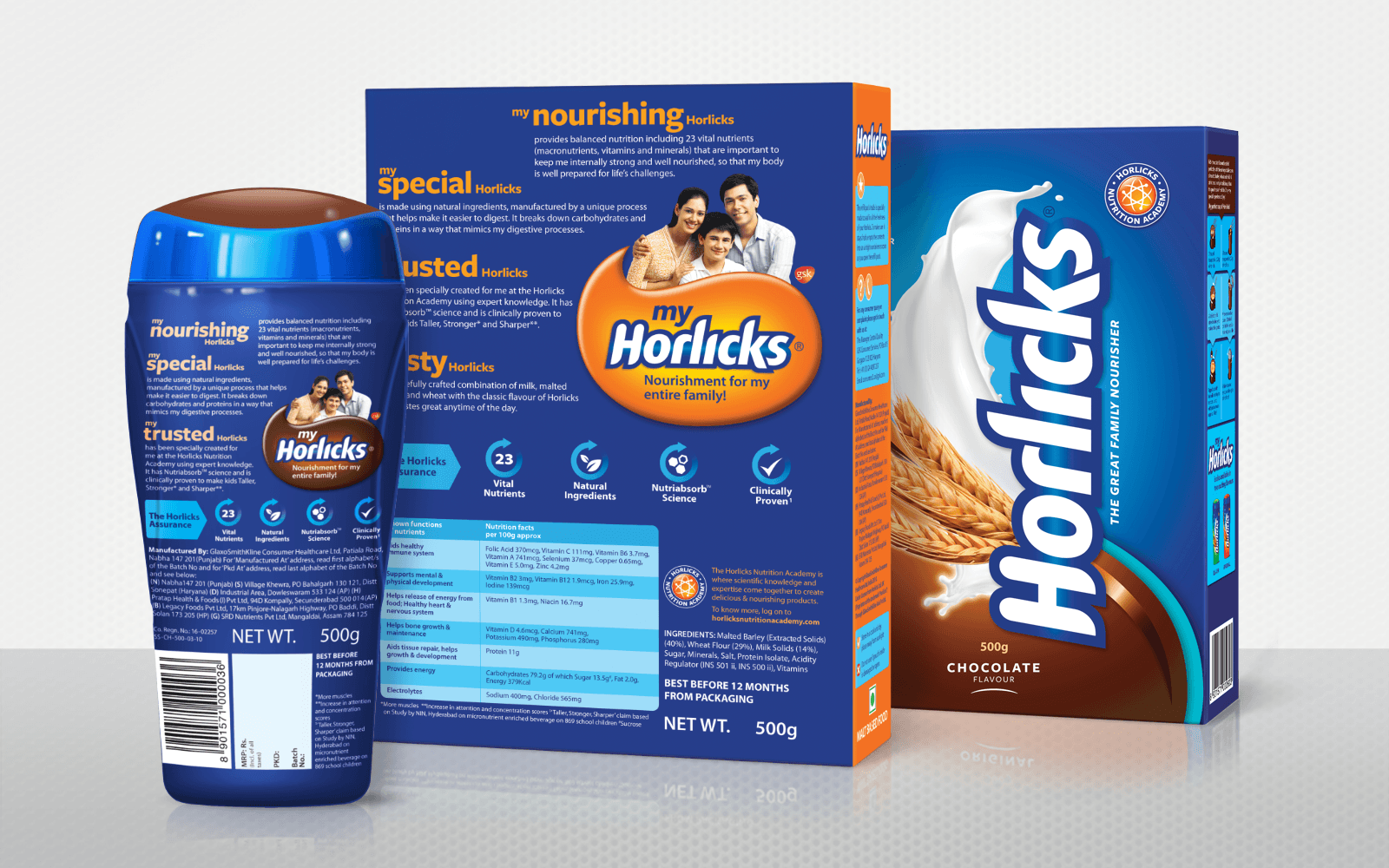
The new Horlicks range was united by a single structure across all HFD products to bring about consistency and create memorable brand recall on the shelf. Strong design logic and detailed brand guidelines made it easy for their internal agency to translate the design across all future products.
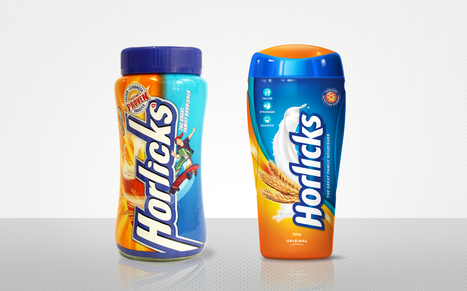
Old and new comparison
CLIENT
GlaxoSmithKline
New Delhi, India
DESIGN
Arati Iyer
Priya Patil
Mona Solanki
Anushree Kapoor
ILLUSTRATIONS
Raviraj Ullagaddi
YEAR
2010
COMPANY
Brand Union